We use cookies to give you the best experience on our website. If you continue to browse, then you agree to our privacy policy and cookie policy.


Flutter Range Slider is a highly interactive UI widget for selecting a smaller range from a larger data set. It provides rich features: numeric and date-time ranges, labels, ticks, dividers, and tooltips.
Select numeric and date ranges. Render intervals with precision for both numeric and date ranges. For dates, from year to second intervals are supported.

Render the range slider in both vertical and horizontal orientation.

Easily customize the labels. Built-in support for numeric and date types. Customize the format, render at specific intervals, and add prefixes and suffixes. You can also visualize data as text assigning values like low, medium, and high.

Render dividers in each interval to show the ranges in an intuitive way. Customize the size, shape, and position of the dividers easily.

Set both major and minor ticks in the axis. Use major ticks to show the intervals clearly and minor ticks to help choose the values between two intervals easily. You can also customize the positions of tick marks.

Use tooltips to show more info about the current selection of ranges during interaction. Customize the format, whole text, and visibility using the built-in APIs. You can show tooltips in rectangular or paddle shapes.

Select only discrete numeric and date values.

Various drag mode options are available to control thumb dragging. The options are onThumb, betweenThumbs, and both.

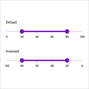
Change the minimum and maximum positions of the horizontal and vertical range slider in the reverse direction.

The Range Slider is easily accessed by screen readers.
Customize each element of the Range Slider.


Greatness—it’s one thing to say you have it, but it means more when others recognize it. Syncfusion is proud to hold the following industry awards.


